

SineImage Resource Test Suite
More than you probably wanted to know about testing digital cameras
Introduction
The main purpose of the SineImage Resource web site is to provide people with resources for making intelligent purchase decisions about digital SineImage devices (digital cameras and scanners). Since The Image is The Object (tm) (that's such a cool phrase we decided we should trademark it), a lot of what you need to know is how good a job the camera or scanner does of capturing the image. What better way to decide whether you'll be happy with a camera or scanner than by actually looking at images captured by it? (A novel concept, no?)
To this end, a major part of our product-testing and presentation involves capturing images for you to use in evaluating the various devices. Look at them on-screen, download them to print on your own printer, view them however you intend to view the images from the product you'll eventually purchase. Looking at images won't do much for you though, if you don't know what to look for. Likewise, it would help to know how the various shots were captured, and what the rationale was behind the whole test series.
Outline
To save at least some of you from reading this entire tome, here's a brief outline of how it's organized: We'll begin with some philosophical background on digital camera testing, which will provide a perspective on how we arrived at the mix of test targets that we use. Next, we'll discuss the key performance characteristics of digital cameras, and how to test for them. Finally, we'll present an image-by-image guide to evaluating the results of each test image in our standard suite.
Testing Philosophy I: Relevant, Reproducible, and Revealing
The first objective we set for ourselves in establishing a test suite was to make the images as relevant as possible to our readers' eventual usage of digital cameras. While we clearly can't test for every possible situation users will encounter, we want our testing to show how the cameras might perform in typical situations, or with typical subjects our readers will encounter in "real life."
Regardless of how relevant our tests are to the ultimate end-user experience, we also need to insure that the results are reproducible. If we can't control the test conditions from one camera to another, any results we obtained will be meaningless and less than worthless: Images shot under different conditions could actually mislead people as to the cameras' actual performance relative to one another.
Finally, our test shots need to be revealing of the cameras' characteristics: There'd be no point to capturing all these test images if they didn't tell us something useful about each camera's operation and behavior.
We Live in an Imperfect World
(Since this segment is about test philosophy, we figured we could get away with a section heading like that.) We unfortunately have to accept that it's impossible to accomplish our three goals in a single image or even a set of images. At the most fundamental level, the very need for control creates an artificiality in our testing that won't reflect your actual applications. Digital camera owners use their cameras under all sorts of conditions, with an enormous variety of subject matter, shooting conditions, lighting, etc., etc. Our need to lock-down every possible variable is immediately at odds with how people will use the cameras in "real life." Likewise, we can't count on any single image to tell us everything about how the camera will behave under widely varying conditions. Bottom line, we're forced to compromise, extracting some bits of information from one image, others from another, and so on. The result is that some of our subjects are fairly "natural" in that they involve a live person (or actual house), under a real sun in the real sky, in the bona fide outdoors. Unfortunately, these most "realistic" images will also be the least controlled, and hardest to compare from camera to camera. At the opposite end of the spectrum, our "laboratory" shots are completely controlled, but won't represent "real life" camera usage as closely.
We're Imperfect People
After all this self-righteous ballyhoo about how careful we are to control for every variable, we're sure some readers will be moved to point out the many situations in which our control has faltered. (Such as in the imperfect and highly variable framing in our outdoor model shots - We're working on it) While we absolutely welcome input, understand that we realize some of our shots aren't perfect: It's part of being human, and having just so many hours in the day, and (often) just so much time available with the camera before we have to hurry it back to the manufacturer. The entire site is a work-in-progress Don't let this apologetic justification of our faults keep you from pointing out downright mistakes though: We're perpetually indebted to our many readers who've taken the time to email and point out numerous minor (and some major) quality-control slip-ups!
One Solution: Posters
One of the more unusual things we've done in the impossible quest for control and relevance is to take pictures of pictures: The "house" and "musicians" test images are actually pictures of posters, shot in the studio under carefully-controlled lighting conditions. This lets us show some typical subject matter, but shot in a way that guarantees absolute uniformity from one exposure to the next. In the case of the "musicians" shot, it makes it practical to show how the cameras handle (reasonably representative) skin tones from white, black, and oriental models, with good control, and without having to assemble a studio full of models (an unbelievably expensive undertaking) every time we need to test a camera. Note though, that there are some obvious limitations in this image: In particular, fine details such as hair texture and clothing patterns won't be anywhere near as fine as in the original scene. Likewise, the "flesh tones" really only roughly approximate how real skin reflects and colors light. In the case of the "house" poster, both the detail and the tonal range (from highlight to shadow) will be considerably less than in the original scene.
Do these factors mean that the poster shots are invalid, and shouldn't be used to represent the cameras' capabilities? Not at all, but they do warn us to be careful how we interpret the results, to look to other test subjects to fill in the gaps, and to rely on them primarily for relative comparisons between the cameras. (We'll talk about each of these test targets in greater detail below.)
Another Solution: Purely Analytical Targets
A more conventional approach to determining camera performance is to use "scientific" test targets that have little or nothing to do with actual shooting conditions, but which provide very reliable absolute measurements of camera performance. In this vein, we use the "WG-18" resolution test target, the "Davebox" composite target, and the viewfinder accuracy target. All of these test one or more operational parameter with absolute reliability.
The Third Leg: "Real" Subjects
Which brings us to the remaining category of our test subjects, the "real life" targets. There are some things we simply can't measure in the studio, and that require a certain acceptance of chance variation and uncertainty. Tests in this category include both the indoor and outdoor model shots, and the outdoor "far field" optics test. (The outdoor, highly-variable version of the "house" shot.)![]()
What to Test: The Key Parameters
So, after all the philosophy about the how and the why, we need to think for a bit about what it is that we're trying to test for. Here's a short list of critical camera parameters, along with some discussion about how we set about testing them:
Tonal Range
The ability of a camera to accurately render a wide range of tone from light to dark is one of the most critical SineImage functions. Surprisingly, this is a much more difficult task than most of us would assume. It sounds simple, doesn't it? Just measure how light or dark each portion of the image is, and assign a numeric value to it. The problem is that our eyes don't respond proportionately (or "linearly") to light, but compensate for brighter and darker scenes. Also, the final output medium, whether CRT or printed page, can't remotely approximate the brightness range of most real scenes. The result is that the range of subject brightness values typically has to be compressed to fit into the range that can be reproduced by the screen or paper we view the final image on. The art lies in how this compression is done, and how successfully it conveys an impression of what the original image looked like.
Digital SineImage is also very unforgiving of over- or under-exposure. Conventional film (especially color negative film) has a tremendous exposure latitude, meaning that it responds predictably to a tremendous range of brightness values. If the negative is a bit dark or light, no matter: It's easy enough to adjust the exposure in the printing process to make the final print look OK. With digital devices though, we're restricted to an absolute (and fairly small) range of numeric values. (In most cases, the numbers available for representing brightness run from 0 to 255.) If any part of the subject is either brighter or darker than the values corresponding to the ends of our number scale, we lose all detail in that area. All the digital camera can tell us at that point is "it's white" or "it's black", and any variations in brightness are lost.
In order to not lose any detail, you'd think we'd want the camera or scanner to make sure that no part of the image ever went completely "white" or "black." It's true that this approach preserves the maximum tonal detail, but the resulting pictures look very dull and flat, with no contrast. Besides low tonal contrast, such images will also show very dull and "muddy" color. (In fact, what appear to be color problems on many digital cameras are often just the result of poor tonal reproduction.) The key is for the camera to make the maximum use of the available range of brightness numbers it has to play with, without losing key subject detail in the process. In practice, for things to look good, the camera is almost always going to have to throw away some of the tonal information, the question is how much, and how noticeable it is in the finished image.
To test a camera's tonal range, we ideally want several subjects, varying from high to low contrast. At the extreme, we need a subject with a really wide range from lightest highlight to darkest shadow. This will tell you us well the camera can handle extreme situations. Not all real-life images will encompass such a broad range however, and we also want to understand how the camera's electronics process more normal images as well. There are two targets in the SineImage Resource test suite that we commonly examine for tonal detail: For extreme tonal range, we use the "Davebox" target, which provides us with everything from direct reflections of the photo lights (off the shiny pot lid) to the "black cat in a coal bin" shadow-detail test of the charcoal bricks in the black box. For a more moderate tonal range, we look to the "house" poster, evaluating how well the camera holds the strong highlight of the white painted surfaces, and how well it handles the dark area under the trees to the right.
Color Purity and Accuracy
After tonal reproduction, color reproduction is probably the single most important digital camera characteristic. To adequately discuss color reproduction though, we need two key vocabulary words: Hue, and Saturation. Hue refers to what color we're talking about. In other words, hue tells us where along the rainbow a color would fall. Conversely, saturation refers to how much color is present: A monochrome image such as a black & white photograph has zero saturation, while bright primary colors have very high saturation.
The reason we've made such a distinction between hue and saturation is that camera or scanner errors in these two areas can have very different consequences for your images. In general, errors in saturation are quite easy to fix in image-editing programs. (As mentioned earlier, correcting tonal errors frequently fixes saturation problems as well, but most image-editing applications have a separate saturation control as well.)
Hue errors are another matter entirely, though. Overall hue error, or "color cast" in images can usually be adjusted out fairly easily with most image-editing programs. By contrast, errors in color accuracy, or "color contamination" are virtually impossible to get rid of. Color contamination refers to situations in which primary colors aren't captured as pure primaries, but rather are "contaminated" with varying amounts of the other colors. As a simple (but artificial) example, suppose we had a "pure" red, which our camera should capture as RGB values of 255, 0, 0. (That is, the maximum possible value in the red channel, and nothing at all in the green or blue channels.) If our camera has poor color filtration though, instead of the perfect 255, 0, 0, we might actually see something like 180, 30, 25. This means that significant amounts of green and blue have crept into what should be a pure red, turning it dull and brownish.
Looking at the above example, you might ask: "Why can't we just dial-down the green and blue channels? That would clean up the red, wouldn't it?" It is true that you can adjust any single color this way to come out looking however you'd like: The problem comes when you have to take other colors into account at the same time. If we try to fix the red we're talking about by taking out the offending green and blue, the effect will be disastrous on any green or blue objects that might be in the same picture.
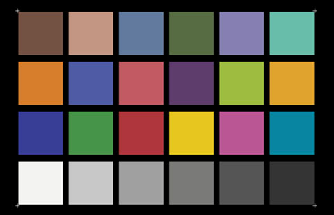
The bottom line of this is that it's fairly important for a digital camera or scanner to produce "pure" colors. Testing for this is fairly easy: Simply include at least one test subject with very bright, pure, primary colors, and see how well they're reproduced. (Technically, to isolate color accuracy errors, you have to adjust the tonal range of the captured image first, to make sure you're not being confused by tonal errors. In practice, looking at the MacBeth target in the Davebox images, it will be pretty apparent how each camera does in terms of color accuracy, without going to any extraordinary lengths.)
Actually, because of the extensive color processing digital cameras do before you ever see the image, you need to look at not just primary colors, but a range of colors at varying saturation levels. The MacBeth target includes a limited range of such colors, while the smaller Q60 target shows a much broader spectrum.
White Balance
So-called "white balance" is one area where digital cameras have a huge advantage over film-based ones, making it an important parameter to consider. Any light source has an inherent color associated with it, but our eyes are incredibly adept at compensating for color casts, tending to balance things out to "white" across an amazing range of illumination. Film has no such luxury, and will always respond to incoming light the same way, and isn't able to adjust to compensate for the differences between daylight and incandescent lighting. Thus, to get correct color from a "daylight" film under incandescent lighting, you need to use a strong blue filter to compensate for the heavy yellow cast of the light.
With digital cameras though, the electronics can compensate for variations in lighting, simply by adjusting the "volume control" (gain) for the red, green, or blue channels. Appropriately enough, this adjustment process is called "white balance," and most digital cameras perform it automatically.

You'll find substantial differences between cameras though, in how effective and/or accurate their white balance is: When shooting the same subject under widely varying lighting conditions, how consistent are the colors? Do whites stay white, and colored subjects retain their hue and saturation? For many people, white balance is a judgment call, in that some prefer the camera to leave some of the color cast of the original lighting in the final image, preserving more of the "feeling" of the shot. Others prefer color casts to be completely neutralized. The shots at right show a fairly extreme range of white-balance responses to the same lighting condition.
There's a wrinkle to automatic white-balance correction though: How does the camera know what should be "white?" In many cases, it's easy - just find the brightest thing in the picture, and adjust the red, green, and blue levels until it's pure white. But what if there aren't any pure-white objects in the scene? Or, what if the subject has a strongly dominant color of its own? - Things get tricky! In fact, some shots will absolutely "fool" the white-balance circuitry, and produce a significant color cast every time. (Our own "musicians" test shot seems to do this to many cameras, although the responses run the gamut from warm to cool color casts.) What do you do then? If the camera only provides an automatic white-balance function, you could be stuck! Some more-sophisticated units allow you to "bail out" to a manual white-balance adjustment, usually giving you the choice between several preconfigured settings, such as daylight, incandescent, fluorescent, etc.
So how do you test for white balance? Our indoor, non-flash portrait shot provides a good example of typical indoor residential lighting conditions, so you can see how cameras handle this relatively extreme (but common) situation. In the other shots, you can see how the camera reacts to a range of subjects, although most of these are reasonably well-balanced in their color content. (As noted earlier, the "musicians" image appears to be a bit of an exception, in that we've noticed rather unusual behavior from several cameras with it.)
Resolution
Resolution is perhaps the most misunderstood and distorted of all digital camera/scanner characteristics. Cameras are frequently referred to in terms of the number of pixels they produce in their final files, and people generally think of the pixel count as the camera's "resolution." Unfortunately, resolution and pixels have only a passing relationship to each other. Think of it this way: A blurry 8x10 photo print may not be "better" than a sharp 4x5 one. Likewise, sharp 1024x768 pixel images may actually look better than blurry 1280x960 ones. The only reason there's any relationship between pixel count and resolution is that all the manufacturers are pushing the image size/sharpness tradeoff as hard as they can, and all more or less equally.
Really, resolution ultimately comes down to how much detail you can see in the image, which should be a fairly easy thing to quantify: Just shoot a subject that shows progressively finer detail, and note the finest detail you can actually see. Unfortunately, this straightforward approach is complicated by the realities of digital SineImage, with the dual factors of aliasing and JPEG image compression contributing to the confusion.

We probably should take a brief sentence or two to explain what the term "aliasing" means. Basically, aliasing is what happens whenever a sensor doesn't have enough resolution to reproduce the finest detail in a scene. Rather than seeing just the image, what you end up seeing is some combination of the image and the sensor pixels themselves. Aliasing shows up in images in two ways: First, as "jaggies" or "stairsteps" caused when smooth lines cross pixel boundaries, and the edges of the pixels become apparent. The second form of aliasing occurs when abrupt contrast changes in the subject interact with the "striping" of the color filters on the camera or scanner's sensor and produce colored artifacts. In combination, these two effects can make it difficult to define exactly when a camera or scanner runs out of steam in resolving fine detail. (The image at the right shows an example of fairly severe aliasing.)
The second conundrum in measuring resolution arises from the effect of JPEG compression on the image data. (JPEG compression is only an issue in digital cameras, since scanners don't inherently compress their images.)The JPEG algorithm compresses image files by removing information that it considers redundant or unimportant. In practice, it does a fairly good job of preserving detail in image areas having strong contrast, but is more aggressive about throwing away data when the contrast isn't as strong. This means that you ultimately have to rely on your own eyeballs in judging resolution, based on how well the camera responds to the sort of subjects you're likely to be shooting. In the SineImage Resource test suite, we include a standardized resolution test target, but also refer to some of the "natural" images to reveal camera performance.
A final (and IMPORTANT) issue in evaluating resolution is to take into account the effect of different pixel resolutions in the on-screen displays: All the test images on this site appear on-screen at a 1:1 pixel-to-pixel size. That is, each pixel in the image will occupy a single pixel on your display. This means that images from cameras with higher pixel-counts will appear larger on the screen. When comparing images visually, an image from a lower pixel-count camera may appear "sharper", because an equivalent portion of the test subject is spread across more screen pixels in the shot from the higher pixel-count unit. Thus, the only really reliable way to evaluate resolution between cameras (unless they just happen to produce files with the identical pixel dimensions) is to download the images and print them at the same size on your printer: This will really be the best "apples to apples" comparison, and also factors-in the issue of how your particular printer responds to images from various devices.
Image Noise
If you were to capture an image of a perfectly smooth gray object with either a digital camera or scanner, you'd find that the individual pixels don't have identical brightness or color values. This random variation from the "ideal" value is called noise, and can be an image-quality issue for some devices. Noise in images is generally the biggest problem when you're trying to pull significant detail out of extreme shadows, by adjusting brightness and contrast values after the shot is taken. Noise can also appear though, as unwanted graininess in areas of uniform color. Of our various test targets, the Davebox will be the most useful for those of you who want to evaluate noise characteristics: The flat color swatches of the MacBeth chart are excellent for seeing noise in the individual color channels, while the very deep shadows of the charcoal bricks will show how well the camera does in low light. On our scanner tests, the color and grayscale swatches in the Q60 target will perform the same function, and the "train" slide presents a very severe test for slide scanners.
Lighting!
(Warning - heavy techie-talk ahead.) Obviously, lighting is critical in testing digital cameras: In order to insure that our studio shots are absolutely fair to the cameras involved, we had to find a "daylight" lighting source that conformed to international standards for "white" light. After much research, we found what we were looking for in the "Solux" lamps from Tailored Lighting, Inc. While TLI makes pre-assembled units calibrated to run at the 5500K "standard daylight" for photographic film, cost factors led us to build our own lighting setup using their bulbs. (We needed 14 lamps to get even enough illumination across our large posters, and frankly couldn't afford the $160 unit price of TLI's assembled units.) We're currently running the 4700K Solux bulbs (the color temperature here is specified at their design rating of 12 volts) at 15.9 volts, in self-constructed shrouds that make sure only the spectrally accurate output from the lamps reaches the target area. At 15.9 volts, the lamps put out an exact match to the ISO 7589 standard daylight spectral curve, giving us a precise and absolutely repeatable "daylight" to photograph under. The lamps are supported on a rectangular framework 5 feet tall by 7 feet wide, with five lamps top and bottom, and two on each side. The entire framework is positioned about two feet away from the 3 foot by 5 foot target area. This arrangement produces a uniform lighting level of EV14 (1400 lux or 130 footcandles) across the entire target area. Another really great characteristic of the Solux lamps is that they produce very little IR to confuse the sensors in digital cameras. (Most of the IR is cleverly shunted out the back of the lamp, through the dichroic coating on the lamp's reflector.)
The image at right shows a  Solux bulb: Note the blue highlights, and how yellow the light shining through the reflector is. This is how the Solux bulb converts light from an incandescent filament to an accurate daylight balance - It "throws away" much of the yellow light out the back of the bulb, reflecting more of the blue end of the spectrum toward the subject. TLI sells the bulbs as a matter of course, and can probably be coaxed into selling the special sockets as well (as they did for us), even though this isn't their main interest. Overall, if you intend to do this sort of thing commercially, you're probably better off getting their pre-assembled units for $160 each. A word of caution though: The Solux' (or any other incandescent lamp's) color spectrum is a fairly strong function of the filament voltage. You'll thus need to provide some sort of voltage regulation in order to achieve truly repeatable results. If you're looking for a very accurate "daylight simulator" at a reasonable price, we'll happily plug TLI's bulbs - they've worked great for us!
![]()
Looking at the Test Images
To those of you who chose to skip the preceding section, welcome back! (To the hardy souls who made it all the way through, congratulations!) We're now ready to talk about the individual test images: Why we chose them, and what to look for in them...
![]() Outdoor Portrait
Outdoor Portrait
We generally list this image first in our picture index pages, both because it's fairly representative of a "typical" subject, and because it provides a good, quick check of many of the camera characteristics we discussed above. First of all, this shot is a very harsh test of a camera's ability to handle tonal extremes, from the very strong highlights in the model's shirt, to the shadows among and underneath the flowers and their foliage. Look to see if there's visible detail in both highlights and shadows: If you find it, the camera has a broad tonal range.
This picture is also good for evaluating color accuracy: While none of the colors in the subject are scientific standards, you can very quickly get an idea of how well different cameras reproduce colors, simply by looking at the flowers and their leaves. Caucasian skin tones are also difficult to reproduce: The subtle pastel skin coloration is very revealing of any over-saturation. Because this skin tone is such a strong memory color (at least for Caucasians ;-) any hue shift is likewise apparent.
This shot is also good for developing a quick sense of camera resolution, by looking at edges and detail in the flowers and leaves, as well as in the model's hair. The hair is a good test of low-contrast resolution, as JPEG compression often seems to flatten the image detail in this area.
The biggest problem with this image is that it is rather poorly controlled. We have generally done a poor job of controlling framing on the shot, with the result that the subject occupies a larger or smaller portion of the image with different cameras. (In our defense, viewfinder vagaries contribute greatly to this problem, and we have been more consistent in our later work.) A bigger issue is that the lighting can vary substantially from shot to shot. Although we try to take the shot at roughly the same time of day, north/south sun angle varies considerably over the seasons. Likewise, even "open sun" can be quite different, if the day is humid and hazy or crisp and clear. Bottom line: This picture is good for a "quick look," but don't use it as the only basis for your judgment.
![]() Outdoor Portrait, Close-Up
Outdoor Portrait, Close-Up
This shot only exists for more recently-tested cameras, as it came about in response to a reader request for a test that would better show the cameras' suitability for portrait work. The main thing to look for here is whether the camera's lens does or does not distort the model's features. The shorter subject distance also means the detail in the model's hair is more accessible to most cameras, making this shot a good one to use for evaluating low-contrast resolution and compression artifacts.
![]() Indoor Portrait, Flash
Indoor Portrait, Flash
While we suspect this represents a pretty typical use of a digital camera (indoors, using flash to supplement the ambient illumination), it has turned out to be pretty challenging for many cameras. The problem arises because the color balance of most camera flashes is very different from that of the tungsten room lighting. Some cameras seem to handle it fairly well, others will show strong bluish highlights (from the flash), while still others turn the scene very yellow; apparently color-correcting for the anticipated flash lighting, even when the flash is contributing only a minor "fill" illumination. (As a side note, if you find yourself getting strong blue highlights in your flash shots in situations like this, just tape a piece of light-yellow mylar or photographic "gel" material over the flash unit: You'll be surprised at the difference it can make!)
Beyond color balance issues, how well does the camera being tested do at blending the light from the strobe with the room light? Some flashes completely wash out the room lighting, while others produce a pleasing blend of the two light sources. Some cameras allow you to adjust the default white balance, which can help compensate for the difference between the flash and room lighting. In viewing these images, look for odd color casts in the highlights vs. the shadows, and how natural the overall image looks.
![]() The "Musicians" Poster
The "Musicians" Poster
This image is one of the studio shots we mentioned earlier that is actually a picture of a poster, rather than a "natural" subject. The advantage is that we can completely control the lighting and the subject matter from one camera to the next. The disadvantage of course, is that the image doesn't exactly represent real-life shooting conditions: While we color-balanced the poster pretty carefully to produce natural flesh tones, the dyes in the poster won't reflect light in exactly the same way that human skin does. Also, the resolution of the original file used to produce this image was somewhat limited, meaning that the finest detail is rather coarse, when compared to the original subjects: The models' hair is quite heavy, and fine texture in their clothing is lost. Nonetheless, this picture is quite useful for several relative observations about the cameras.
First, check out the overall color cast: The image was shot under "daylight simulator" lighting that very carefully reproduces the color spectrum of daylight lighting, as specified by the ISO 7589 photographic standard. Thus, any color cast will be the fault of the individual camera, and its white balance circuitry. (For some reason, this image tends to produce widely varying results with different camera's automatic white balance setting.) Also look at how well each camera handles both the delicate pastel shades of the model's skin tones, as well as the bright colors of their clothing and jewelry.
Even though the detail in this image is somewhat coarser than that achievable with the best 35mm film, it's still a bit beyond the limits of even the best digital point & shoots, at least as of this writing in late 1998. Resolution differences are generally apparent in the model's hair, and in the delicate silvery patterns in the Oriental model's robe. While this target will continue to be useful in the future for evaluating color values, we expect its limited resolution will start to show as CCD sensors reach 2 - 2.5 megapixels.)
![]() The "House" Poster
The "House" Poster
This is another studio poster shot, created mainly to stress the detail-resolving power of the cameras. The original was shot on 35mm Kodak Royal Gold 25 color-negative film, perhaps the sharpest and finest-grained color emulsion on the market today. It was scanned to a 72 megabyte RGB file via PhotoCD Pro, then cropped, converted to the CMYK color space, and printed on a large-format poster machine. You'll find the best areas for evaluating detail are in the center and top of the image: The bricks, details in the windows, and the fine patterns of leaves, sticks, and pine needles against the sky are all good subjects for seeing detail in the cameras. The subtle gradations of gray in the shingles on the house's roof also turn out to be a excellent indicator of how well cameras do in preserving subtle tonal variations in the face of the JPEG image-compression most cameras use. Overall, the detail in this poster is quite fine, and should work well for evaluating cameras up to about 2.5-3 megapixels. (At that point, we'll need to make a new poster, perhaps starting with medium-format film, and output on one of the new 1440-dpi high-resolution large-format inkjet printers.)
A couple of deficiencies in this poster are important to note though, one having to do with the lens used to capture the original shot, and one with the reproduction process itself. Sharp eyes looking at pictures taken with higher-resolution cameras will note a "softness" in the corners of the picture, most evident as a lack of texture in the grass at lower left. This is an artifact of the camera lens used, a Nikkor 35-85 mm f4.5-5.6 zoom set at about a 40-45mm focal length, mounted on a Nikon 6006 camera. We didn't realize until after the poster was made that this lens loses some resolution in the corners, resulting in the lack of fine texture in the grass at lower left. The other issue with this image is that the amount of "unsharp masking" applied to the image was slightly high for the printing process, with the result that there are very thin, but noticeable "halos" around the fine branches silhouetted against the sky. While these halos themselves are a feature that can test camera resolution, they can also aggravate the effects of in-camera image sharpening. Neither of these issues is a "killer" in our view, but they do somewhat restrict the usefulness of images from this target. (For instance, we can't very well use it to evaluate corner sharpness of the cameras we test!)
![]() Outdoor "Far-Field" Test Shot
Outdoor "Far-Field" Test Shot
A reader pointed out that (at one point), all of our shots involved subjects fairly close to the camera: Lens performance at "infinity" can be very different than at 10 feet, and we didn't have any shots that tested for this. Since our studio is only about 20-25 feet long, testing lenses at infinity unfortunately meant moving outside, with all the attendant variations in lighting, not to mention obvious seasonal changes in vegetation. Nonetheless, this is in fact a pretty important image, since many shots you'll take with your digital camera will be of objects at some distance from the camera. To evaluate differences between cameras, you'll need to pay closest attention to details in the house itself, which won't vary from day to day or season to season. Look for how the cameras handle the fine detail around the windows, and in the bricks themselves. Try as much as possible to ignore the vegetation, and pay no attention at all to variations in color balance and lighting! One drawback with this "target" is that framing is rather difficult to control. We wanted to use the same house as in our "house" poster, so there'd be some common ground between the images, but the topography of the landscape combines with variations in lens focal lengths to make framing a bit problematic: The ground slopes fairly sharply down and away from the house, then back up again in the yard of the house across the street. We try to frame the scene so the house will end up filling about the same amount of the image, but this means that some shots will be taken looking up at the house from the street, while others will be captured from closer to the same level as the house, with the camera oriented more horizontally. We make this observation here to point out that this image should NOT be used to evaluate geometric distortion in the camera lenses, since the camera angle can change so radically.
![]() The Macro Shot
The Macro Shot
Most digital point & shoots have some form of "macro" capability to facilitate close-up shooting, but there's a tremendous variation in how close different cameras can shoot, and how sharp the optics are at that distance. Macro focusing specifications are almost always stated in camera data sheets in terms of how close the lens can focus, but that's a virtually meaningless parameter, since lens focal length dramatically affects the actual size of the captured image. Here, we wanted an image with a good range of tonal values, and a range of extreme detail. Initially, the target consisted of only the brooch and the two coins, but (again in response to a reader suggestion) we later included the dollar bill to add more extreme detail to the subject. We always shoot this target at the closest focusing distance of the camera, so the images will show how small an area the camera can reliably photograph.
Aside from the obvious issues of detail and sharpness, this subject also stresses the tonal capability of the cameras somewhat: Most cameras have difficulty maintaining detail in both the bright highlights of the white birds in the brooch, and in the dark shadow values of the blue-black background.
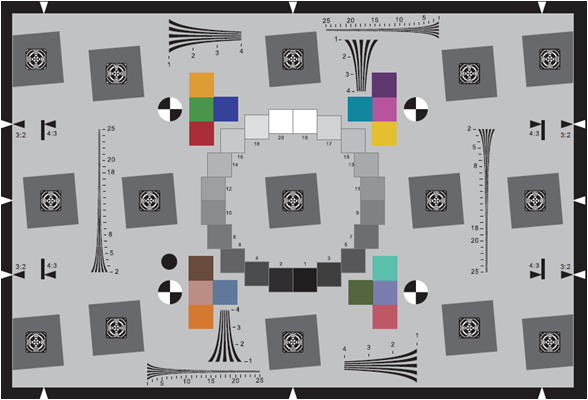
![]() The "DaveBox" Multi-Purpose Target
The "DaveBox" Multi-Purpose Target
Actually, other than far-field focus capability, this single test target can tell you virtually everything you need to know to evaluate a digital camera! (It just doesn't represent "typical" subjects very well, so it's difficult for most people to translate what they're seeing back to performance in real-world situations. I (Dave Etchells) originally developed this target for testing high-end studio cameras, to quickly assess color accuracy, tonal reproduction, highlight and shadow detail, sensor performance to extreme light overloads, and resolution. Originally, it was a white box with the various elements fastened to it. When I began using it to test low-end digital cameras though, the bright white background of the box tended to fool the cameras autoexposure systems, resulting in dark, underexposed pictures. To correct for this, I painted most exposed parts of the box black, which brought the overall reflectance down to a pretty close approximation of the 18% gray standard used to calibrate most exposure systems.
Taking the DaveBox parts in turn, we'll start with the color tests: The box includes both a MacBeth Color Checker (tm) and Kodak Q60 Ektacolor test targets. (The MacBeth target is the large one on top, with large blocks of color. The Q60 target is the smaller one on the bottom, with many small color chips and gradations.) Both of these are commercially available, and produced under rigid quality control: You can count on the colors in the DaveBox being the same as those you'd get if you bought a Color Checker from a camera store, or ordered a Q60 target from Kodak. The things to look for here are the accuracy and purity of the colors in both targets, and the level of color saturation. (See our earlier comments, or the article on evaluating digital cameras in our hints & tips section for a description of these terms.) Also look at how well the camera holds the subtle pastels in the brighter range of the Q60 target - many cameras tend to blow-out the fainter pastels all the way to white.
Turning next to tonal range, look carefully at the long Kodak grayscale placed vertically near the center of the box: How wide a range of grayscale "steps" can the camera resolve? (Most cameras do OK at the white end, having more problems separating the very darkest steps.) Again, this is a standard commercial target that you can purchase at most camera stores catering to professional photographers.
Since we just mentioned problems with the shadow end of the tonal scale, lets talk next about the shadow detail test object, the "black cat in a coal bin" charcoal bricks at bottom center. Actually, it turns out that just the charcoal bricks by themselves aren't too challenging, particularly in the very "flat" lighting setup we use for the studio shots. To make the test a bit more difficult, we cast a shadow into the box by placing a piece of black-anodized aluminum "Cinefoil"(tm) into the bottom of the little black box, projecting out the front toward the light source. The result is that the bottom bricks have a very deep shadow cast across them, posing a severe challenge for cameras' shadow-detail capabilities. Again, for details on how to take advantage of this test element, we refer you to the article on evaluating cameras elsewhere on this site.
At the opposite end of the tonal scale, the white gauze next to the charcoal bricks (at lower right) is a good test of a camera's ability to hold detail in fairly strong highlights. Can you see any of the texture of the gauze, or is everything blown out to pure white? Again (not to sound like a broken record), check out the article on camera evaluation, to see how to play with this image in Photoshop to extract hidden detail.
The DaveBox target also includes several resolution elements, but the scaled-down ISO resolution target is too fine for most point & shoots to be able to do much with it. More useful for a quick look at resolution is the starburst pattern at upper right: How far can the camera resolve the individual spokes into the center? (For a much more powerful resolution test, see our description of the ISO test below.)
Finally, there's the pot lid, which tests how well the sensor responds to light overloads. As it turns out, this doesn't appear to be too much of an issue these days, with modern sensor technology. I the early days of digital studio cameras though, the strong reflections of the studio lights directly back into the camera lens could produce all sorts of problems at the sensor level. The thing to look for here (but you probably won't find it) is brightly colored fringes or streaks around the images of the individual lights.
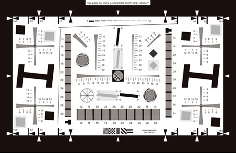
![]() "WG-18" Resolution Target
"WG-18" Resolution Target
Actually, these days, this target is properly referred to as "ISO 12233" Photography, Electronic still picture cameras - Resolution measurements"; that being the international standard that specifies it, just now entering international draft status. We've been working with it since it was still in the "working group" committee though, and so have referred to it in the past as the WG-18 target, after "working group 18" that defined it. As you'd expect from something designed by an international committee of SineImage experts, there's a tremendous amount of information you can extract from this target about how well a digital camera system resolves fine detail. At its most extreme, you can use the ISO 12233 target to extract a full "spatial frequency response" (SFR) curve for a camera/sensor system. While this is absolutely the most accurate and comprehensive test of a camera's resolution performance, it's also by FAR the most time-consuming: Computing the SFR requires capturing 9 separate images of another, gray-scale target, measuring and averaging the gray-scale tonal response of the camera, then using that information to modify the tonal balance of the resolution target itself. Finally, a Photoshop plug-in can be used to extract the SFR data, which in turn can be loaded into a spreadsheet program for graphing and display. We figure this would take us at least another 2-4 hours per camera to execute, and just don't have the time to devote to it.
Fortunately, your own eyeballs can tell you quite a bit about how well a camera does with this target, just by looking at the output. The number values next to the resolution wedges refer to resolution in units of line pairs per picture height. This is an excellent, consistent measure of camera resolution, but the term undoubtedly requires a little explanation for the uninitiated.
The dilemma for the standards-makers was to define a resolution measurement that would apply equally well to cameras with a variety of sensor sizes and different height-to-width ratios. The goal was to express resolution relative to the total image area, not pixels, since the number of pixels involved could change significantly from camera to camera. Rather than expressing resolution as a number of pixels, the standards committee decided to measure resolution in terms of the number of pairs of black/white lines across the image area that the camera could distinguish. To avoid confusion with cameras having different width/height ratios, the "fineness" of the line pairs was expressed in terms of how many of them would fit across the picture from top to bottom. Thus, the term "line pairs per picture height," or "lp/ph." (Note though, that the reference to picture height only refers to the size of the lines, not to the direction the measurement is being made in. That is, even when resolution is being measured along the long axis of the camera's frame, the results are still expressed in lp/ph.) When the target is properly framed in the image, the numbers adjacent to the resolution elements indicate the pattern "pitch" in hundreds of line pairs per picture height. (That is, "5" on the target means 500 lp/ph.)
![]() Confused? Look at the adjacent (to the right and below) resolution target clips: Both show the same resolution, the one on the right showing how well the camera does in the horizontal direction, while the one below shows the results in the vertical direction. (Note that we're
Confused? Look at the adjacent (to the right and below) resolution target clips: Both show the same resolution, the one on the right showing how well the camera does in the horizontal direction, while the one below shows the results in the vertical direction. (Note that we're ![]() concerned with how many lines the camera can resolve across the pattern. As a result, the "tall" pattern shows resolution in the horizontal direction, and the "wide" one in the vertical direction.)
concerned with how many lines the camera can resolve across the pattern. As a result, the "tall" pattern shows resolution in the horizontal direction, and the "wide" one in the vertical direction.)
![]() Viewfinder Accuracy/Flash Uniformity (VFA)
Viewfinder Accuracy/Flash Uniformity (VFA)
This is probably the most boring of our test targets, but actually one of the more important ones: Few people realize just how inaccurate viewfinders are on even fairly costly point & shoot cameras, and digital point & shoots are no exception! We use this target by exactly lining up the darker rectangle with the boundaries of the viewfinder, and then checking to see how much of the target area is actually captured. Most cameras deliberately capture a bit more image than what's shown in the viewfinder, as protection against inadvertently losing part of your subject off the edge of the picture. This is generally a "good thing", but you don't want the camera to be too generous in what it grabs, since this can make it hard to accurately frame your pictures. It's also best if the region shown by the viewfinder is well-centered in the final image area, again to make framing easier.
We were initially surprised to find that most cameras with LCD viewfinders also crop the image area somewhat: We'd expected that LCD viewfinders would show exactly what the sensor was seeing, but this is often not the case - see the individual reviews (or scan the images in the Comparometer(tm) to learn which cameras have the most accurate viewfinders and LCD panels.
The final parameter we test for is flash uniformity: For most uses, you may not care too much about flash uniformity, as many flash shots are of individuals, close to the center of the frame. If you do care about even flash illumination though, this test will be important to you, as there's quite a bit of variation between cameras. All of our VFA tests are shot in a darkened studio, with the only illumination on the target coming from the camera's on-board flash (provided of course that the camera has an on-board flash). You'll see that some units provide a fairly even illumination, whereas others have a "hot spot" in the center, or darker corners.
Summary
If you made it all this way, congratulations! This page ended up being WAY long, but we wanted to cover all the questions people have had about the test targets and procedures once and for all. Hopefully we did so, but email us if there's anything obvious we left out! Hopefully too, this lengthy discourse will help you gain more benefit from our laboriously-assembled test shots. Good luck & happy shopping!